Logos


Re-Branding
Sometimes a logo can have the right idea but the wrong execution. Below are some examples of re-designs that I think express the essence of the original design but in a more captivating way.
Here is a proposed re-branding for Kong Technologies/ Kong Surfboards
Before
Cluttered
Hard to Read Font
Awkward Spacing & Distribution
After
Streamlined Layout
Easy to Read Font
Balanced Elements
Softened Black Color
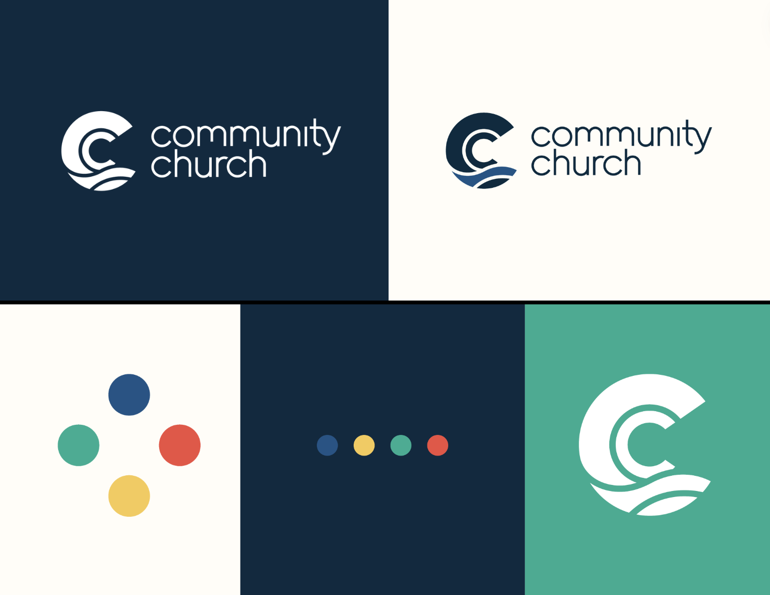
This is an example of re-branding for one of our Community Church classes. Both logos below were designed by me but the first logo was created before a true brand identity had been established. Once I was able to curate a full brand identity, the second was edited to match our branding guide seen to the right.
Before
Busy & dated
Difficult to see the Missional Icons
The heading looks broken, and the kerning is imbalanced.
After
Heading consistent with brand guidelines
Clean representations of the 4 missional Icons
Balanced spacing of elements


